

CyberCube Exposure Signal Module
Overview
I’ve worked as a UX design intern for CyberCube in this 2022 summer, and CyberCube is the market-leading cyber risk analytics company, serving the largest and most sophisticated global insurance institutions in the world. During this 12 weeks internship, I mainly worked on designing a new landing page, and two new features for CyberCube’s products to better support cyber insurance underwriters and brokers’ daily work.
I’m going to mainly go through one important feature I’ve worked on, the exposure signal module, which used to support insurance underwriters assess the exposure faced by their clients more accurately and completely.

My role & practices
UX design
Interaction design
Visual Design
1-1 Interviews
Heuristic evaluation
Usability testing

Tools used
Figma
Zeplin
Miro
Excel

Projects information
Duration: 4 months
Work directly with 2 product managers, 2 UX designers and 5 engineers
Report directly to design team leader and product director
Unlock the mystery of Cybersecurity Insurance 👁
Cybersecurity insurance is an emerging field that might sound new to you, but it works just like other common forms of insurances such as commercial insurance and health insurance, used to hedge against the risk of contingent or uncertain loss. Basically, cybersecurity insurance helps cover financial losses due to cyberattacks or related risks for companies.

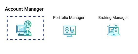
A quick scan of the SaaS product — Account Manager (AM) 🖥
CyberCube has 3 SaaS products, Account Manager (AM), Portfolio Manager (PM) and Broking Manager(BM). I would like to use abbreviations to refer them in the following texts.
AM, PM, and BM each have clearly defined user types as their features and functionalities are tailored to meet the specific needs of their respective audiences. For this project, AM is the product I worked on, and the main target users of AM are insurance underwriters.
Basically, AM helps insurance underwriters to make data-driven risk selection and pricing decision, also ensures a profitable book of business that aligns with their underwriting workflow.
*Account Manager, Portfolio Manager and Broking Manager are 3 SaaS softwares from CyberCube.Inc
So… What is the problem? 🤔
I got a new task request from Product Manager one day.
“Hey Mia, can you help the product team design the new feature 'exposure signal module' for AM? It needs to be launched in Q3, and I've attached our PRD for you to take a look at.”

*Definition of “Exposure Score” and “Exposure Signal”
While exposure scores are an aggregated metric that can help users understand the overall level of risk, exposure signals can provide the level of detail needed to identify specific vulnerabilities or areas of weakness that need to be addressed.
However, CyberCube’s software AM only provided a composite exposure score to users, but no individual operational exposure signals that feed into the exposure score. As the UX designer, my goal was to create a user-friendly and intuitive module that consolidates all exposure signals, empowering underwriters to thoroughly analyze and assess an organization's cyber risks through a visually-informative and seamless experience.
Innovative research for a niche user group 🗝
Overcoming challenges in a B2B SaaS setting
At this point, I had a rough idea of the direction I wanted to take. However, to truly make a design that meet the needs and expectations of our target users, I knew I needed to dive deeper.
little did I know that conducting user research for this new feature would present unexpected hurdles and constraints. These challenges stemmed from CyberCube AM’s unique position as a B2B SaaS software targeting a highly specific and niche user group, insurance underwriters in the cyber security field, making it more difficult to recruit participants in short time.
Given the resource-limited user research environment, I approached the situation with an innovative mindset.
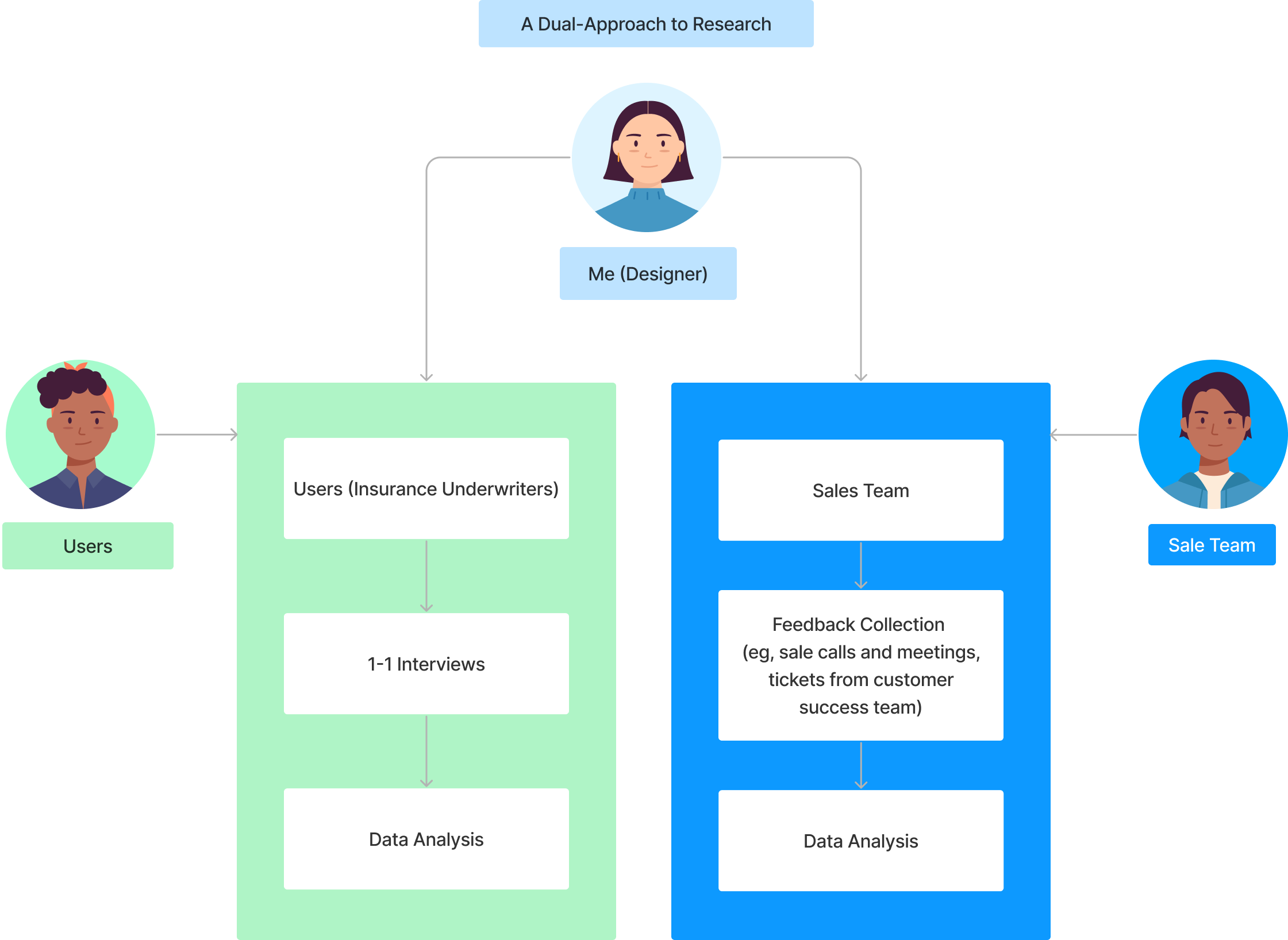
"How am I supposed to gather adequate user feedback when there's only a handful of real users I can directly talk to?” I asked myself.
By taking the initiative to communicate proactively with different stakeholders, I uncovered a wealth of valuable user feedback that had been hiding in plain sight: the sales teams and customer success team.
There are a few “indirect” ways I leveraged to gather valuable user feedback for my research, including analyzing support tickets and tapping into feedback from the sales team's interactions with clients. These data, coupled with in-depth interviews with a small but representative user sample, allowed me to uncover patterns and key insights that will guide me in making the right design decisions later.
Research Insights 🌟

Polishing the persona
Fully grasped the benefits of our existing persona (partially completed) developed by CyberCube’s previous designers, I polished this to be more context-specific in order to help me and other designers better identify with insurance underwriters.

Design with an explorative spirit
Key Interfaces - V1
In the first version, I created the main interfaces for users to view exposure signals, investigate signals in details and download the customized report.
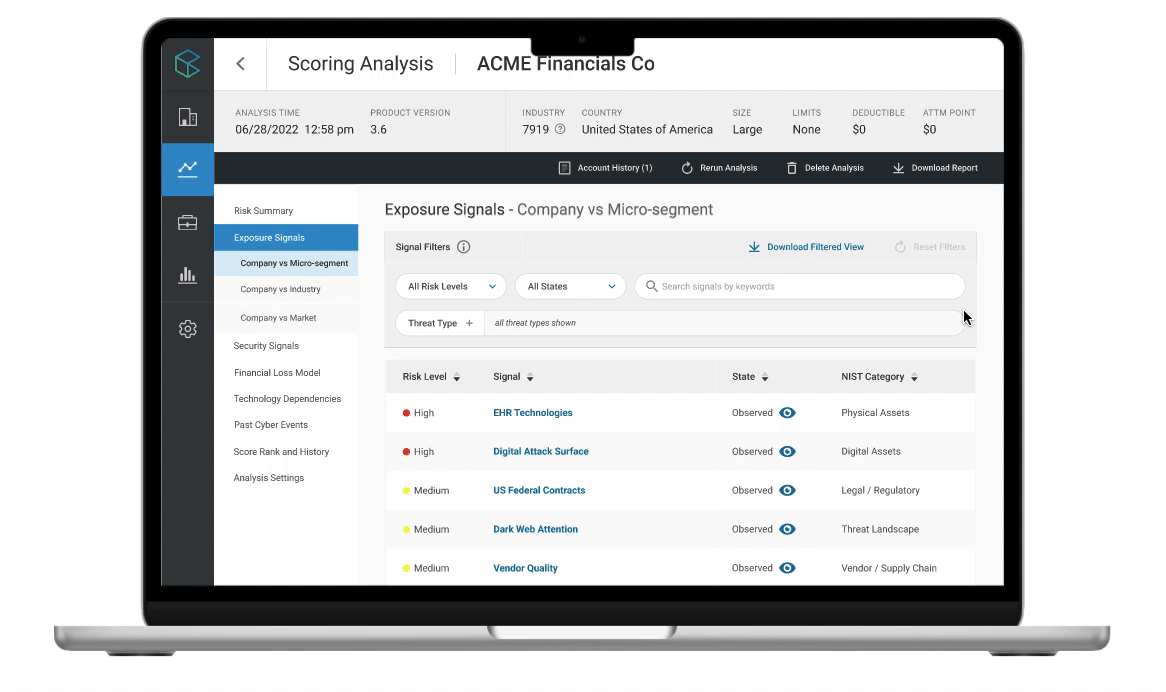
01. View all exposure signals of the institution
Based on research, I know that insurance underwriters are all struggled to investigate exposure indicators by piecing together public information from disparate sources, thus I designed a page featuring a data table that consolidates all exposure signals (related to the institution) into a single, comprehensive view. This saves users time by providing them with quick and easy access to the information they need.

02. Look into more details of a specific signal
When users click on an exposure signal in the data table, they will be directed to the 'Actionable Insights' page that I designed. Recognizing that users expect a straightforward way to understand exposure signal data, I designed the 'Actionable Insights' page to provide additional information on the selected exposure signal, with an emphasis on providing actionable and contextualized insights.

03. Download the customized report
Research indicated that users want to have prioritization in exposure signals, and that’s why I designed the 'Customize Report' form to allow users to prioritize and include the signals that matter most to them in their final report.

Testing + Design iteration
I sought to validate my design decisions by conducting user testing. My goal was to ensure that the design was not only intuitive and straightforward for users to navigate, but also provided them with the core information needed to understand the exposure signals data. Through these tests, I gained valuable feedbacks of areas where the design could be improved. The feedbacks I received helped me refine different sections of the design.
Exposure signal data table
BEFORE

I used the "rank in recent month" metric as a column in the table to represent the severity of exposure signals. However, most users were not intuitively sensitive to this way of sequencing the signals' severity at first glance.
Exposure signal overview
BEFORE

I designed the exposure signal overview with only three cards: the state of the exposure signal, count range, and benchmarking data. However, 3 out of 4 users still felt that they lack enough context regarding why this exposure signal was an important indicator of cyber risk.
Recommendation
BEFORE

3 out of 4 users mentioned that the recommendation section was too general and lacking in specialization. .
AFTER

I adopted a more familiar language by using risk levels (high, medium, low) along with colors that conveyed different emotions. Additionally, I incorporated real-world analogies into the design of the exposure signal's "state" by using a "opening eye" UI element to indicate the observed state.
AFTER
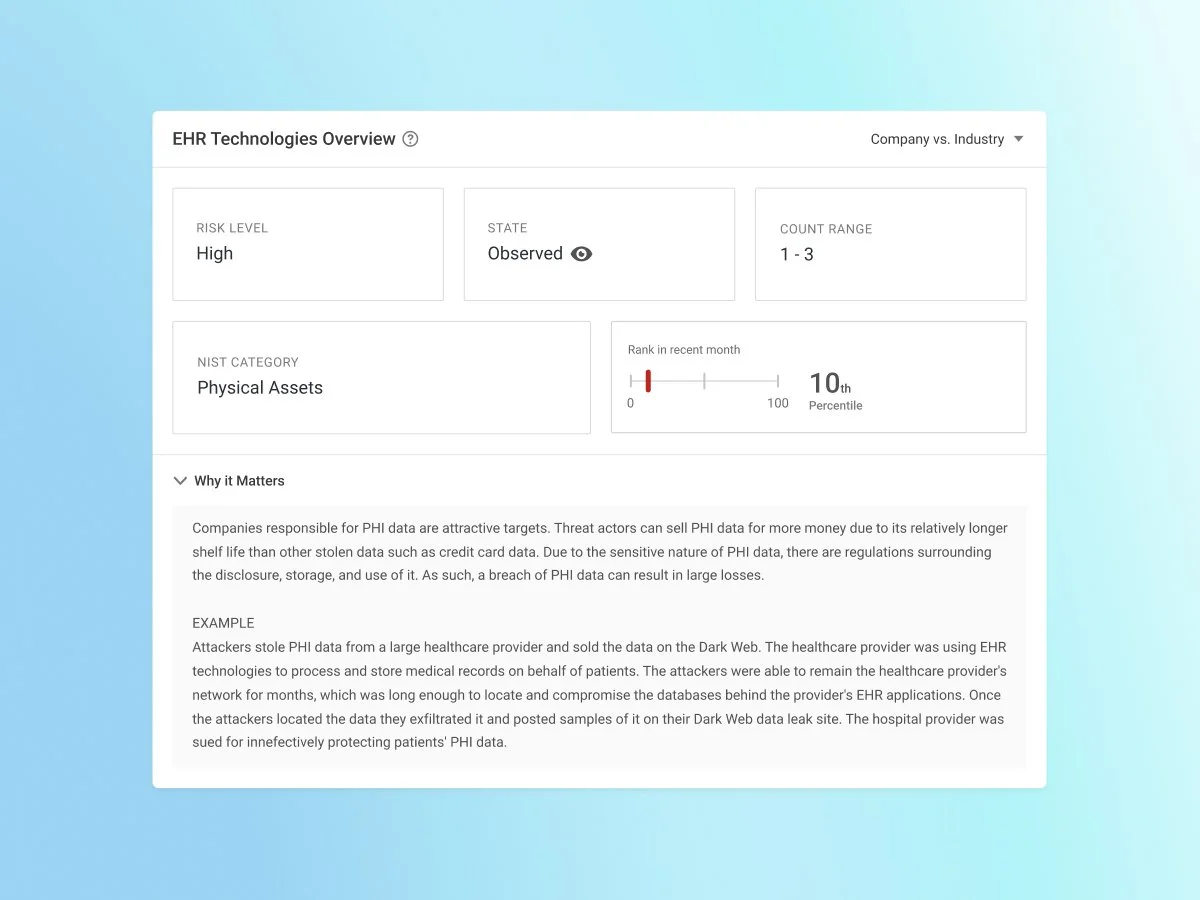
To enhance user understanding, I added two more cards to the overview section: one for risk levels and another for the NIST category. Additionally, I incorporated an accordion below these cards that give users the option to view further information about why this exposure signal matters, meanwhile maintain the overview section clean and uncluttered.
AFTER

To cater to the needs of our target users, insurance underwriters, I integrated an "underwriting considerations" section, which offers more specific and actionable recommendations that underwriters can apply directly to their work.
Customized report
BEFORE

In the old design, users could only customize their reports by selecting signals based on their attributes or characteristics. However, they did not have the option to choose individual signals to include in their report. After iterating, I implemented a drop-down menu that allows users to choose how they want to select signals, which further enhances customization.
AFTER

Final Prototype - Exposure Signal Module
Other improvements include:
Signal filters on exposure signal page
“Zebra stripes” on data table
An integrated experience of investigating exposure signals along with actionable insights
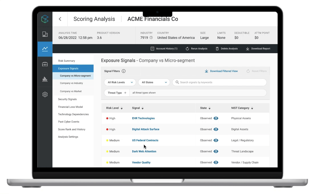
Great flexibility and personalization, download the tailor-made report
Project Impact
The Exposure Signal Module has successfully launched in November, 2022 ! 🎉

Key Takeaways 🌟
Invest time in reading technical documentations for data-driven SaaS product with higher scale of complexity, sort out the overall context, and gather the set of requirements and specifications before jumping to Figma.
Keep iterating on the current workflow to make it considerately faster and efficient for enterprise users.
Take more responsibility as a well-rounded UX designer, never shy to emphasize the importance of user research, and always be proactive to get involved in the whole product life cycle.

“It was a delight to collaborate with Mia Hao. The team admired Mia for her hands-on approach to user experience, user interface, and wire-framing, as well as her strong demeanor. Mia produced outstanding results for CyberCube Analytics. She was not only a dependable and forward-thinking product design intern but also a motivating team player. She contributed significantly to our projects and had high proficiency in knowing what was best for the user. ”
“Mia has been a great asset to CyberCube, and specifically to my Core Services team. From the moment she entered CyberCube, she went above and beyond to expand her UX Design skills for our team and others. She worked with me and the team to develop solutions that were pretty, UX-friendly, and dev-friendly.”